
All you need is context: Cursor as the benchmark for the work UI
Persistent, visible, and structured context is what separates tools you use once from tools that reshape how you work.

That’s the lesson hiding in plain sight across every AI tool that actually works. Not features, not models, not speed. Context.

Cursor proved this for code. AI browsers are trying to prove it for the web. But most are missing the critical piece that makes context management actually work, and ironically, Arc had already solved it before pivoting to Dia.
How Cursor structures context
Look at Cursor’s interface. Three zones, each serving a distinct purpose:
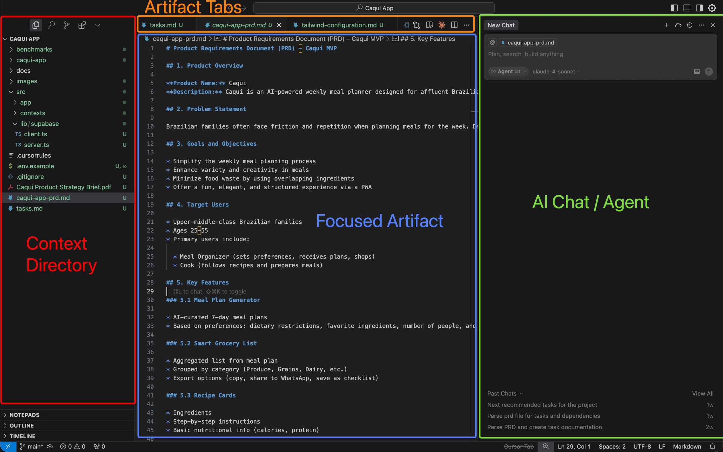
Left: knowledge structure. Folders, files, Git branches. This isn’t decoration—it’s your spatial map. You see where everything lives. You navigate by location, not search. The structure persists across sessions, so you build muscle memory for where things are.
Centre: working artefact. The file, document, or terminal you’re actively editing. One thing, focused, unobstructed. Everything else fades. The centre is sacred—it belongs to your work, not the interface.
Right: AI interaction. Chat, agents, commands. This is where augmentation happens. Critically, the AI sees your context—which files are open, what you’ve selected, and where you are in the project structure. You don’t reconstruct context in conversation. It’s already there.
This structure works because it maps to how people actually manage knowledge work: you need to see what’s available (left), focus on one piece (centre), and occasionally invoke help that understands your working state (right).
Why it works beyond code
I use Cursor for two completely different types of work. Code, obviously—that’s what it’s built for. But also business knowledge: strategy memos, ideation documents, reports, and meeting notes. All written in Markdown, stored in a GitHub repo, managed like code even though it’s just text.
The structure holds for both. For code, the left panel shows my project files. For business docs, it shows my knowledge base structure—product specs in one folder, strategy docs in another, research notes nested by topic. The same spatial logic applies.
Version control is the unexpected benefit. Every change creates a commit. I can diff yesterday’s strategy memo against today’s. I can see when I added a section, who changed what, and why something was revised. That’s impossible in Notion or Google Docs without manual tracking or paying for history—and even then, it’s not structured.
The three-panel grammar works because context is always visible. When I’m editing a strategy doc and need to reference a product spec, I don’t search or switch apps. I see both files in the tree, open the second one, and work with both simultaneously. The AI chat sees both. I can ask it to cross-reference them, summarise differences, or check consistency—all without explaining what I’m looking at.
The browser: king of context
But here’s the thing: browsers are the actual interface layer where most knowledge work happens. You’re not just editing documents. You’re researching, reading, comparing sources, referencing multiple pages, and now—increasingly—asking AI to help you process all that information.
Browsers are the king of context. Or they should be.
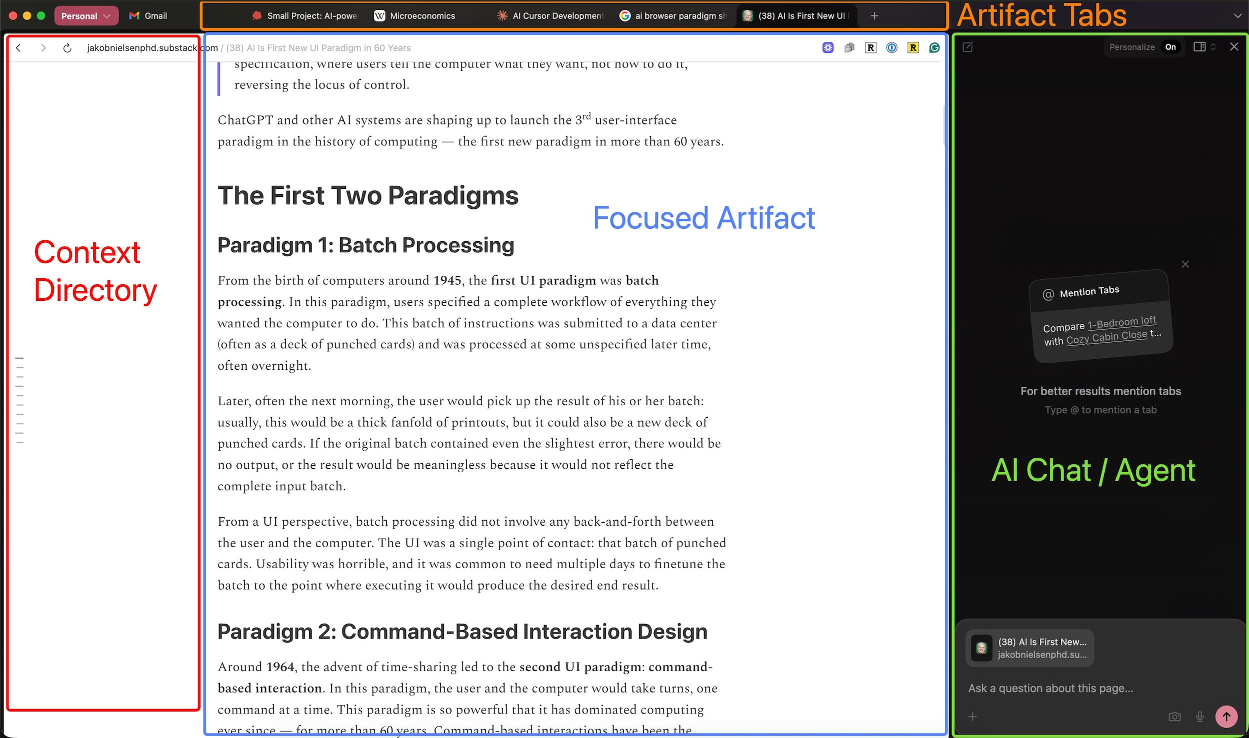
AI browsers—Arc, Browserbase, SigmaOS—recognised this. They saw the Cursor pattern and tried to replicate it. Web page in the centre, tabs or history on the side, AI chat on the right, where you can reference pages and ask questions.
The structure makes sense. But they’re missing something critical: context management.
What Arc got right (and then abandoned)
Here’s the irony: Arc had solved context management for browsers before the AI era made it even more important.
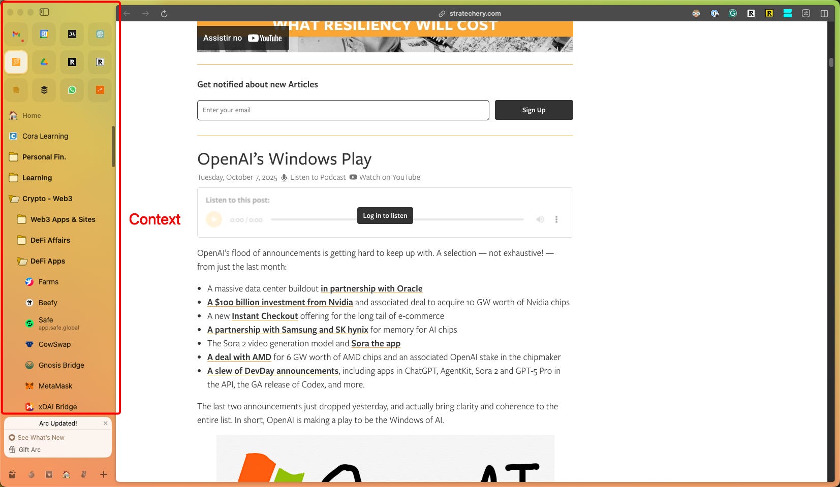
Spaces. Profiles. Nested tab folders. The way you could organise tabs vertically, group them by project or context, pin persistent resources, and keep ephemeral research tabs separate—it was the missing piece. It was IDE-level context management for the web.
Most people don’t work with five clean tabs. They work with dozens. Some tabs are fixed—tools you access constantly, references you keep open, dashboards you check daily. Some are volatile—research tabs for a current project, pages you’ll close in an hour, temporary context that comes and goes.
Browsers traditionally treated all tabs the same: a horizontal strip at the top, chronological, flat. That doesn’t scale. You lose spatial memory. You can’t see the structure. You end up with 47 tabs and no idea which ones matter.
Arc’s vertical, nested, space-separated structure solved this. You could see your context at a glance. Work tabs in one space, personal in another, research for Project X in a folder, persistent tools pinned at the top. It wasn’t just organisation—it was spatial memory for the web.
The Dia pivot and what’s missing
I understand why they pivoted to Dia. Simplification for mass adoption. Solving deep infrastructure limitations from how they built the first browser. Those are real constraints.
But in chasing simplification, they’re abandoning the feature that mattered most—especially now, in the AI era.
When you’re working with AI assistance in a browser, context management becomes critical. You’re not just browsing one page. You’re referencing multiple sources, comparing articles, indexing research, and asking the AI to synthesise information across tabs. If your tabs are a flat, unsorted mess, the AI can’t help you. There’s no structure to reference.
The AI needs to see what you see: which tabs are part of your current project, which are persistent resources, which are temporary research, and how they relate to each other. That requires structure. It requires the nested, spatial, space-separated approach Arc had built.
What AI browsers need to learn from IDEs
IDE users figured this out decades ago. You can’t code with a flat file list. You need folders, nested organisation, and a persistent structure. You need to see where things are and how they relate.
AI browsers need the same. Honestly, every middle OS layer needs to learn that lesson. Tabs as a flat strip worked when browsing was linear. It doesn’t work when you’re managing complex research, cross-referencing sources, and asking AI to process information across multiple contexts.
The solution isn’t removing structure. It’s embracing it.
What Dia (or any AI browser) should incorporate:
Vertical tab organisation. See your tabs as a structured tree, not a horizontal overflow.
Nested folders. Group related tabs by project, topic, or context. Make the grouping visible.
Spaces or profiles. Separate work contexts completely—work vs. personal, Project A vs. Project B.
Persistent vs. ephemeral distinction. Pin the tabs that stay, let the rest flow. Make the difference visually clear.
AI that sees the structure. When I ask the AI to “compare these three research articles,” it should know which ones I mean because it sees my tab organisation.
Arc built this. It worked. The fact that Dia is moving away from it—just as AI makes it more valuable—is the real missed opportunity.
Context is the interface
The pattern is consistent: when AI tools work, it’s because they make context persistent and visible.
Cursor works because you can see your file structure, your working file, and your AI interaction simultaneously. The AI sees what you see.
AI browsers should work the same way. Web pages in the centre, structured tab organisation on the left, and AI chat on the right that understands your browsing context.
But that only works if the context is actually structured. Flat tabs don’t give the AI (or you) enough information. You need spatial organisation, nested groups, persistent vs. temporary distinction, and space separation.
Arc proved this worked. Dia and other AI browsers should be doubling down on it, not simplifying it away.
Because in the end, all you need is context. But you need it structured, visible, and persistent. That’s what makes AI assistance actually useful—and what makes the interface disappear so you can focus on the work.